
Branding
Bad zur Sonne
A stunning public pool in Graz with a glass roof, natural light, and a community that loves it. And absolutely nothing in terms of branding. I used to live around the corner. I noticed. I fixed it.
the challenge
A place worth loving, with nothing to show it
Bad zur Sonne has everything — architecture, atmosphere, loyal regulars and that incredible glass ceiling that floods the pool with light. What it doesn't have is any visual identity whatsoever. No logo. No colors. No brand presence. For a place this special, that felt like a missed opportunity I couldn't ignore.
the approach
Build a brand world from nothing, for the love of it
As a former Graz resident who swam there, loved it and wanted it to look as good as it feels. The logo nests sun, sky and water into one clean geometric mark. Friendly enough to feel welcoming, precise enough for a city-run facility. The hand-drawn pattern library — snorkel goggles, beach balls, palm leaves — adds the warmth and personality that public pool branding never bothers with. Because it should.
The work
From blank canvas to full brand identity

Pin merch

Hats and caps
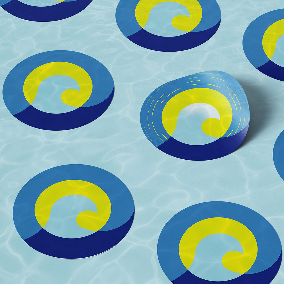
Sticker
the outcome
A complete brand identity, built on principle
Bad zur Sonne now has a full visual world: logo, color system, custom patterns, typography and print-ready materials. It exists because good places deserve good design — not because someone paid for it. This is what happens when a designer refuses to look the other way.