
MetimeBliss
Built around one idea, screen time for soul time, it turns creativity into a daily reset for customers all over the world.
Big ideas, no shape yet
The founder arrived with a big vision and a head full of ideas: creativity as therapy, a product range that would keep growing, and customers all over the world. What she didn’t have was a brand to hold it together. She was honest that she doubted anyone could turn that creative chaos into one clear identity. The brief: make it coherent, make it feel good to open, and build it to stretch into whatever she launches next.
Strategy first, then a world of color
I started by listening: what the brand stands for, who it’s for, and how it should feel in someone’s hands. From there I built the full identity: a logo suite, a typography pairing and a color palette designed to grow with new product lines. Everything is documented in a brand guideline with clear usage rules, and the packaging design carries the unboxing experience through, so the brand feels the same on a screen, a shelf and a doorstep.
From blank canvas to full brand identity
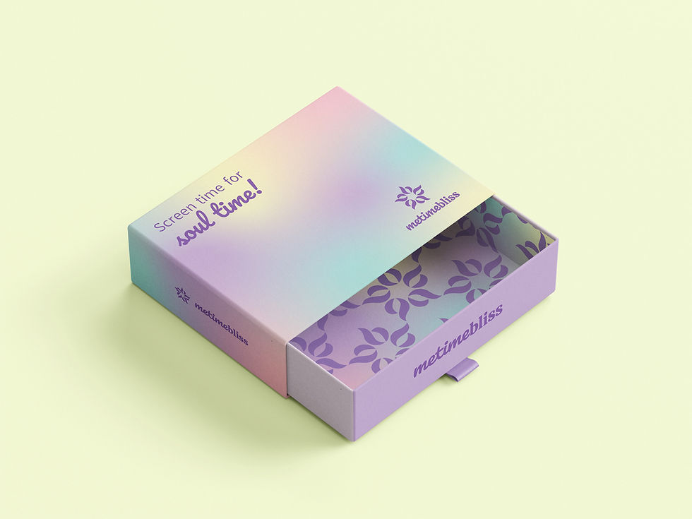
Packaging design

Business card (front and back)

Journal
A brand she recognized as her own
She received the complete identity: every file, every guideline, ready to use from day one. Her reaction said more than any metric could. She was moved, close to tears, because the doubt was gone. The palette turned out to be one she had surrounded herself with her whole life, and now it finally had a purpose. Her brand looks like what she’d been seeing in her head all along.
